
Rethinking
Onboarding
Through
UX Strategy
Probelm Solving and UX Thinking.
When this client first approached us, their onboarding was long, rigid, and non-interactive. It was split into three stages, offered no way to pause or skip, and lacked clear motivation for users to complete it.
Our goal was to turn onboarding from a blocker into a flexible, engaging experience—without sacrificing the client’s goal of collecting important user data.
From Static
to Smart
The original onboarding flow was designed in Figma but lacked interactivity and flexibility. Users had to complete all three stages in one sitting, which created frustration and drop-off.
We redesigned the flow to be:
Skippable, with visual indicators encouraging users to return
Modular, broken into 3 separate experiences
Motivating, using gamified elements and subtle behavioural nudges in the app itself
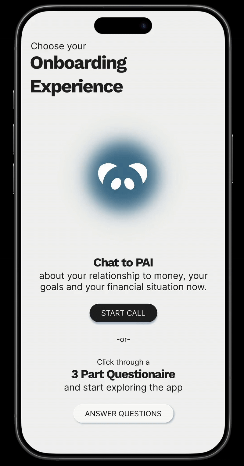
Our redesign added choice: users could either go through a full quiz or Chat to AI and complete any data gaps in the quiz later.

Making DAta input
Feel Playful
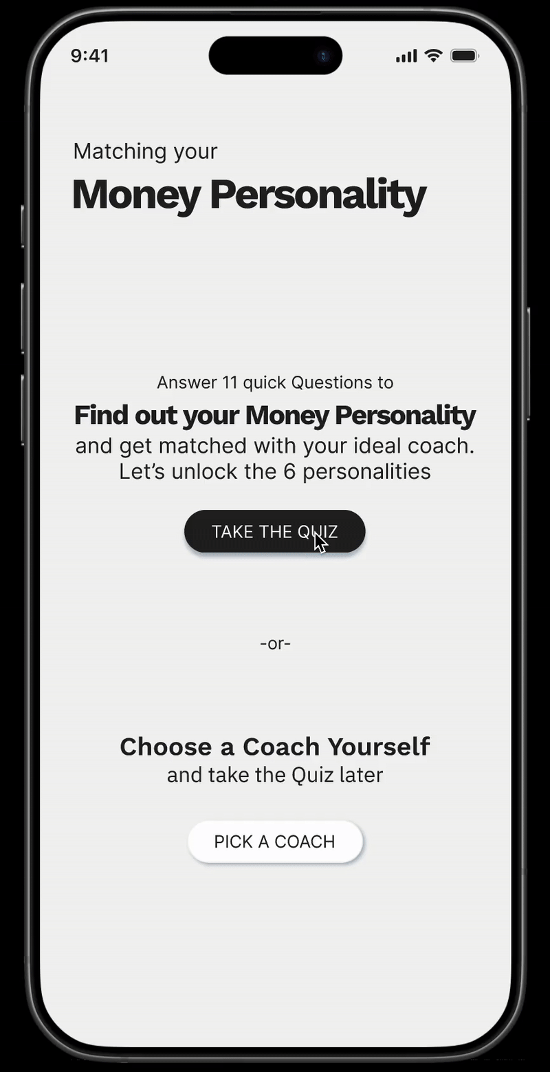
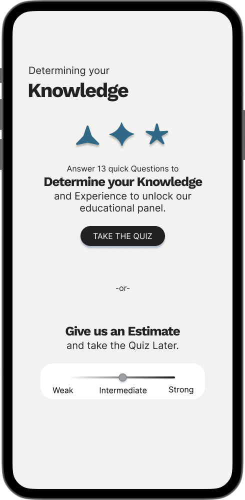
The money personality test was a critical part of the onboarding—it determined the tone of voice, coaching style, and content a user would receive. But as a static 11-question sequence, it felt like a chore.
We turned the quiz into an interactive, visual journey:
Users unlock 6 hidden “money personalities” as they progress through the quiz
Each screen introduces a small reveal animation (a lock, an icon, a reward)
A redesigned progress bar doubles as a motivational mechanism
Giving Users
Options
Not everyone wants to commit to a long onboarding experience right away. So we designed a choice-first flow:
Option A: “Take the full quiz to discover your personality type”
Option B: “Choose a coach yourself and complete the quiz later”
To support this, we developed a coach–personality matching system. Each Money Personality is intuitively paired with a Coach Archetype, so even users who skip the quiz get a semi-personalised experience from day one:
Without Losing Engagement.
Free-Spirit → Energiser
Saver → Strategist
Protector → Guardian
Avoider → Comforter
Rainmaker → Visionary
Spender → Motivator

When the quiz is completed and all the required information gathered, the app displays a satisfying overview of the user’s Money Personality Type.
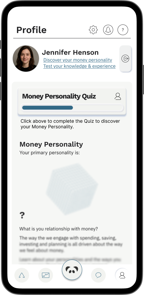
If they user chooses their own coach, the app adapts its tone of voice based on the coach archetype. However, the Money Personality section remains blurred, creating a subtle but effective motivation to complete the quiz later for full personalisation.
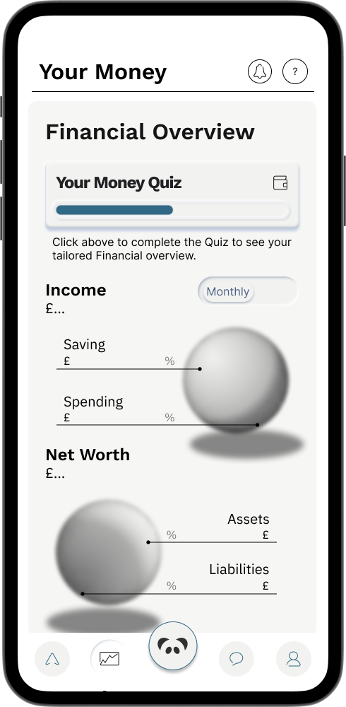
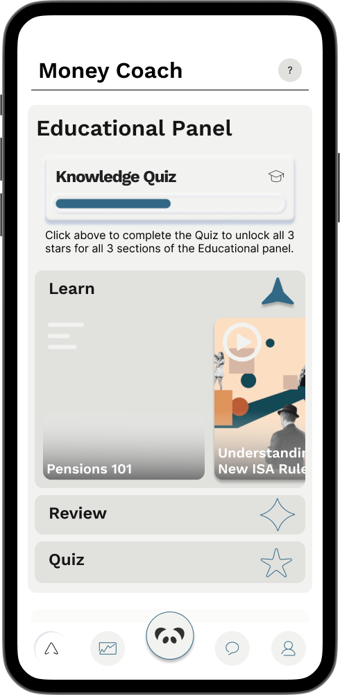
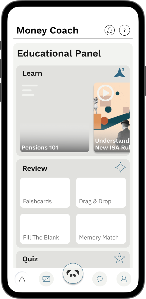
The same principle was applied to all 3 stages of the onboarding PRocess
with reminders and nudges throughout the app, to encourage users to fill all the relevant data for a fuller experience without overwhelming them


This approach respects the user’s time, while using behavioural psychology—curiosity and completion bias—to gently draw them back in, on their own terms.
By focusing on user psychology and flexibility, we transformed a heavy onboarding experience into an engaging, guided journey. The client kept the depth they needed—and users gained the freedom to explore on their own terms.